Ecommerce web design is constantly evolving. We’ve come a long way since the patterned backgrounds of the 1990s and the ubiquitous Flash animation of the 2000s. Going into 2020, online stores have begun to favor a sleek, streamlined design that prioritizes user experience. We predict you’ll see these six trends a lot more in the coming year. We recommend you follow these to help improve the usability of your own site.
1. Accessibility
The Americans with Disabilities Act (ADA) was signed into law in 1990. Back then, most people didn’t own a computer, and the internet wasn’t even publicly available. The focus of the law at that point was on workplace discrimination and accommodations like wheelchair ramps and handicap parking spaces.
Since then, the internet has become a major part of everyday life. The most recent interpretations of the ADA reflect that.
In 2017, we saw a wave of legal rulings regarding the ADA and the internet:
- A Florida judge found that Winn-Dixie was required to make its website more accessible for the blind.
- In California, a Hobby Lobby motion to dismiss a website accessibility lawsuit from a blind customer was rejected.
- The Southern District of New York ruled that a website accessibility lawsuit against Five Guys could continue.
With this legal precedent, you can expect ecommerce sites to start following the Web Content Accessibility Guidelines. These standards ask that:
- Text alternatives are provided for non-text content
- Captions are provided for videos
- Text is easy to see, audio is easy to hear
- Content can be presented by assistive technologies such as screen readers and screen magnifiers without losing any meaning
- All functionality is available from a keyboard
2. Simplicity
People are more distracted than ever before. And when it comes to online shopping, consumers have plenty of options. There are over 5 million online stores in the world and over 1 million based in the United States alone. So, attention spans are short, and you’ve got a lot of competition.
That’s why a simple design with a clear message is the right approach for 2020. Amazon is the most successful online store of all time, and you can point to their site as an example of ecommerce design that’s not simple at all. But Amazon is in a unique position; they’re 50% of the U.S. ecommerce market.
On the other hand, many of the people who land on your site may be using it for the first time. They won’t be entirely sure that they should buy from you, and you’ll only have a few seconds to convince them that using your store would be a good decision.
Instead of Amazon, be like Apple.
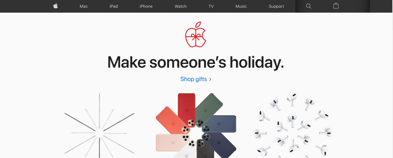
Image Source: Apple
They say that in jazz, the notes you don’t play matter as much as the ones that you do. The same is true in web design. The space you don’t fill in with content matters as much as the space you do.
In the above example from Apple, there’s only one call-to-action (CTA) link above the fold. There’s also a large headline and a few large images to support the message of the CTA. Other than that, it’s all negative space. See how this focuses your attention on Apple’s message? Without anywhere else to go, the eye is immediately drawn to the CTA.
3. Animations & Cinemagraphs
GIFs and other animated elements (loading bars, hover effects, etc.) will also help you grab the visitor’s attention. In recent years, cinemagraphs have become a popular way to add animation to ecommerce sites. These are mostly static images that contain animated components. For example, Home Depot has used a cinemagraph with a spinning drill effect on one of their landing pages. The advantage of cinemagraphs is that they combine the eye-catching motion of a standard GIF with the subtlety of clean, simple design.
4. Dark Mode
Many apps have a “dark mode” feature, which gives users the ability to switch to a black background. This reduces eye strain when the user is reading in a dim or dark setting, and it also extends battery life (black pixels don’t need to emit any light, so they are simply turned off).
Entire operating systems (iOS, Android) came out with dark mode features in 2019. This trend is clearly taking off. Dark mode availability may become the norm for online stores sooner rather than later.
5. Chatbots
You might not have the budget to hire customer support reps, especially if you operate a new or small store. In that case, consider chatbots, which can provide a more affordable way to communicate with your customers in real-time. These automated digital assistants are capable of managing a variety of interactions, from providing product information to scheduling appointments to helping customers make purchase decisions. Even stores that can afford a customer service team have shown an interest in chatbots, as they free up resources that can be used to address other concerns.
As AI technology continues to improve and chatbots become even more sophisticated, expect to see them popping up more and more on online stores.
6. Modernize Your Ecommerce Store
You don’t need to have web development experience to add the features described above to your online store. Major ecommerce platforms like Salesforce Commerce Cloud make it easy to change your theme’s background color to black, and there are many chatbot apps available as well. There are also page builder apps that give you complete control over the look of your online store. These tools allow you to implement modern web design practices such as negative space and color blocks, even if you don’t know a single line of code.
Adam Ritchie is a freelance writer based in Silver Spring, Maryland. He currently writes for Shogun, and his previous clients include Groupon, Clutch and Showbiz Cheat Sheet.
-
 5 Ways AppExchange Apps Can Enhance the Customer Experience
By Lauren Gaskill
Type
Article
Whether you’re looking to create a more seamless approach, meet customers where they are or develop a culture of customer appreciation, the following tips and AppExchange partner apps can help you take your customer experience to the next level.
5 Ways AppExchange Apps Can Enhance the Customer Experience
5 Ways AppExchange Apps Can Enhance the Customer Experience
By Lauren Gaskill
Type
Article
Whether you’re looking to create a more seamless approach, meet customers where they are or develop a culture of customer appreciation, the following tips and AppExchange partner apps can help you take your customer experience to the next level.
-
4 Ways to Improve Sales Performance
4 Ways to Improve Sales Performance
By Lauren Gaskill
Type
Article
How well do you understand the strengths and weaknesses of your sales processes? It’s important to know where improvements can be made — both internally and for your customers.
-
Get Ready for the AppExchange Job Marketplace Retirement
Get Ready for the AppExchange Job Marketplace Retirement
Type
Article
With this proactive involvement, Nuvolar are a key influencer in promoting Salesforce careers to new-to-ecosystem talent and individuals from a diverse set of backgrounds.
-
9 Apps to Help You Reimagine Your Customer Experience
9 Apps to Help You Reimagine Your Customer Experience
By Amanda Matlock
Type
Article
No matter the company size, industry, or business challenge, partner apps and experts help businesses connect to customers. So don’t reinvent the wheel, reimagine it! Here are nine solutions on AppExchange to help you sell smoother to every customer.
-
Learn about the Latest Search Filter Enhancements
Learn about the Latest Search Filter Enhancements
By Amanda Backer
Type
Article
Learn about AppExchange search enhancements, including using new filters for business need, industry, and job role.